Selected Case Study — Design Systems & UX

ADI / Resideo

Vendor brand pages, built as a system

A responsive component library that turns each vendor's brief and assets into desktop, tablet and phone brand pages. Analytics then showed where the page could work harder.

My Role

Senior Designer

Company

ADI Global Distribution (Resideo)

Project

Vendor Brand Pages

Disciplines

Design Systems, Responsive UI, UX Research

Partners

Vendor brand & marketing teams

Tools

Figma, Mouseflow, Google Analytics

+25%Clicks on Featured Products after adding sticky navigation
+15%Click-through after moving the video section
6Reusable component families
3Sizes per component: desktop, tablet, phone
1Click to switch a section to another size
01 / Workflow

From vendor brief to three finished pages

ADI carries products from many vendors, and each gets its own brand page. I run the process end to end, from the first brief to measuring how the live page performs.

  1. 01
    Brief

    Review the creative brief and walk the vendor through the page structure: hero, features and benefits, video, categories, resources.

  2. 02
    Goals

    Ask what the page should achieve and which products or services to feature.

  3. 03
    Asset specs

    Explain the exact sizes and formats each section needs, so assets arrive ready to use.

  4. 04
    Brand kit

    Collect the vendor's UI kit or identity guide to bring their colors and graphic elements into the page.

  5. 05
    Build

    Drop images, copy and colors into components from the brand-page library.

  6. 06
    Three sizes

    Switch each section to its tablet and phone variant with one click. No rebuilding.

  7. 07
    Measure

    Track behavior with Mouseflow heatmaps and Google Analytics, then improve the template.

02 / Component system

One component, three sizes

Instead of drawing a separate module for every device, I built each section as one component with size variants. Content goes in once, and the tablet and phone layouts come with it.

Module per device

18 separate modules (6 sections × 3 devices) to build, update and keep in sync

Component with size variants

6 components, each with a Size property. Update once, and every size follows.

Hero Banner / Size=DesktopDesktop
Hero Banner component, desktop variant

Pick a component, then switch its size. This mirrors how the variants work in Figma.

03 / In production

Bosch Intrusion, at every size

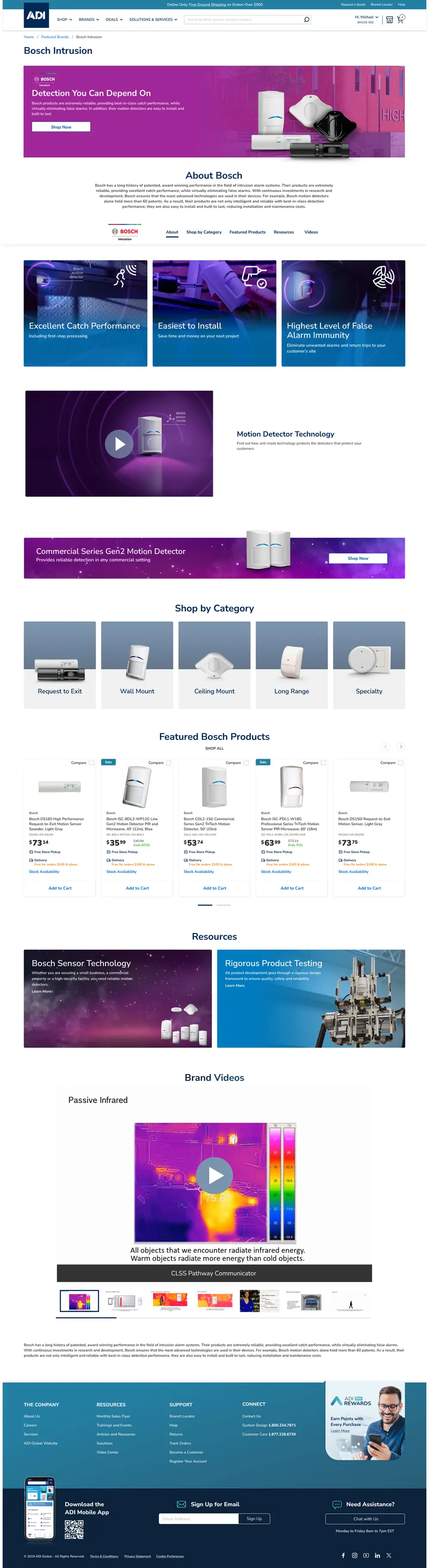
The same components, filled with Bosch's assets, copy and colors, produce a complete brand page for each device. Section order, spacing and calls to action stay consistent everywhere.

  • Hero in Bosch's brand gradient with product imagery
  • Sticky in-page navigation with quick links
  • Features & benefits: 3 modules
  • Video spotlight and thin banner
  • Shop by category, featured products, resources
  • Brand videos, moved to the bottom
adiglobaldistribution.us/…/bosch
Bosch Intrusion brand page on desktop

Hover to scroll · Click to expand

04 / Research & iteration

Letting behavior shape the page

After launch, I studied Mouseflow heatmaps and scroll maps alongside Google Analytics to see where visitors landed, how far they scrolled and what they clicked. Two findings led to changes across every brand page.

Finding 01

Visitors were hunting for products

Saw

After scrolling the page once, visitors scrolled back up and down looking for featured products and prices.

Changed

Proposed a sticky in-page navigation with quick links, so visitors can jump straight to any section without scrolling.

+25%clicks on the Featured Products section
Hero Features Video Categories Featured products Resources Videos scrollback up

Illustrated behavior, and the sticky navigation that fixed it

Finding 02

Video drew attention, but fewer clicks

Saw

The video section was one of the most scrolled-to areas and the second most clicked, but it trailed the hero banner by a wide margin.

Changed

Added Videos to the sticky navigation and moved the brand-video section to the bottom of the page, so visitors pass the rest of the content on the way there.

+15%click-through across the page
The milk-and-eggs principle

Grocery stores put milk and eggs at the back, so shoppers walk past everything else and leave with more than they came for. Putting the most-wanted content last does the same thing for a brand page, and it gave vendors proof that visitors engage with their whole page.

Brand Videos, now the last section on the page

05 / Outcome

Faster to build, easier to use, proven to vendors

The component system made each new brand page faster and more consistent to produce across three sizes. The analytics work turned the template into something ADI could show vendors with real engagement data.

Production

One set of components serves every vendor and every size, so new pages are built from proven parts instead of from scratch.

Consistency

Clear asset specs and brand-kit intake keep each vendor's identity intact inside ADI's template.

Engagement

Sticky navigation and smarter section order raised Featured Products clicks by 25% and click-through by 15%.

Earlier ADI work

Landing-page engagement up 25%, bounce rate down 55%, satisfaction up 15%, interactions and conversions up 10%.

← Back to selected work
Design principle

Make the experience better. Then make the improvement repeatable.

Discuss a project ↗