Caliber
Functioning as Art Director Across Three Lines of Business
Built the creative-review process, brand color system and campaign work for Caliber's Auto Care, Collision and Auto Glass teams — as a Creative Circle contractor, without the art director title.
Building a Process Where None Existed
When I joined Caliber, there was no formal process for requesting or approving creative — art requests came in ad hoc, with no consistent review before work went live. I set up a working process and became the point of contact for each line of business's Senior Marketing Director — Auto Care, Collision and Auto Glass — so that every piece of creative had a clear path from request to approval.
Request
Marketing Directors submitted campaign and content needs by line of business.
Creative Review
I art directed the work, keeping brand voice and color system consistent.
Approval
Sign-off from the relevant Senior Marketing Director before anything shipped.
A Color System for Three Lines of Business
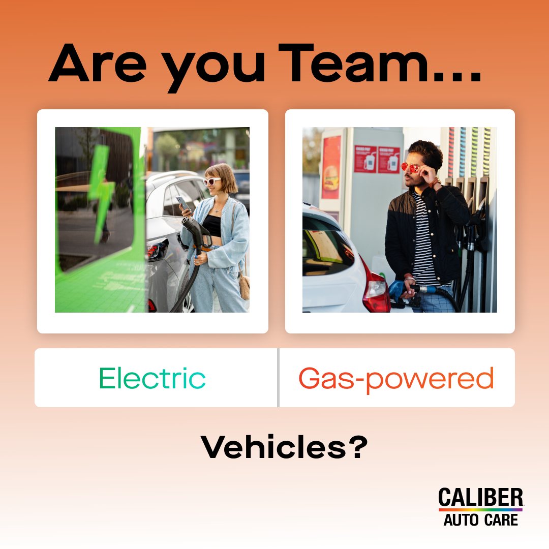
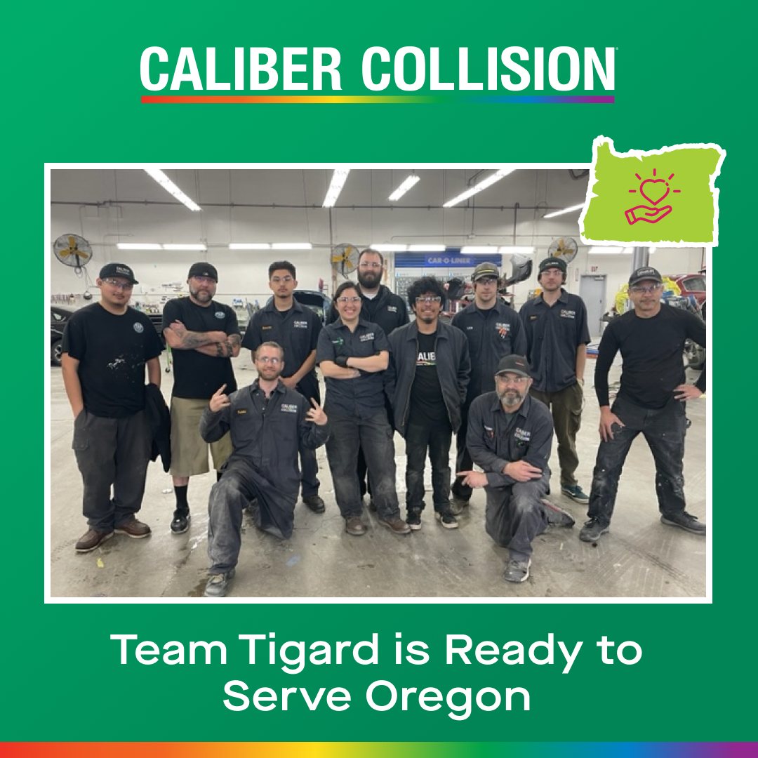
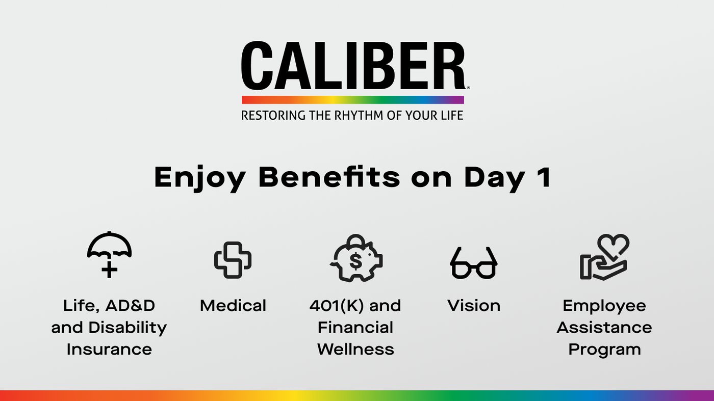
Caliber's Auto Care, Collision and Auto Glass teams shared one master brand, so I gave each line of business its own color to make them instantly recognizable — starting with the treatment of social media posts.
Caliber Auto Care
Social content

Caliber Auto Glass
Social content

Caliber Collision
Oregon Legacy Project — Social content
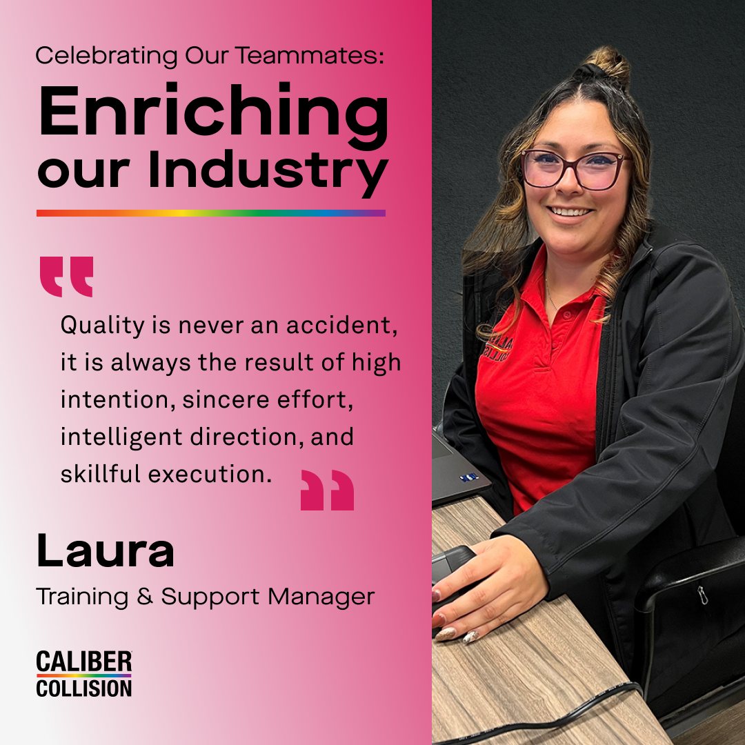
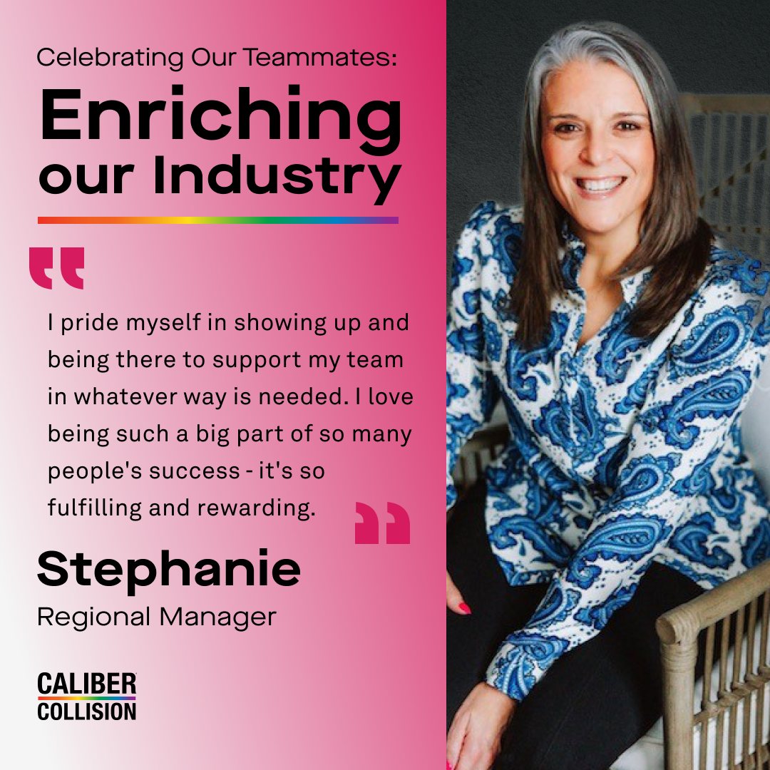
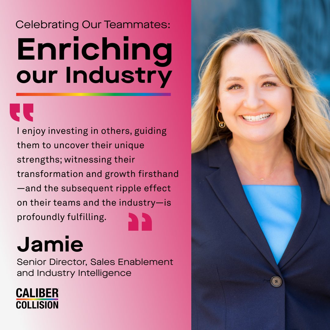
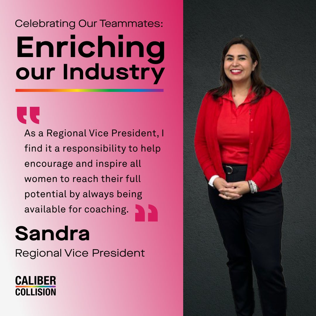
Enriching Our Industry
One corporate campaign I art directed spotlighted Caliber's leadership team — made up mostly of women — sharing their stories in their own words. I used one of the brand's palette colors, pink, to give the series a distinct, consistent look, then carried that same treatment across social, a landing page and an email send.


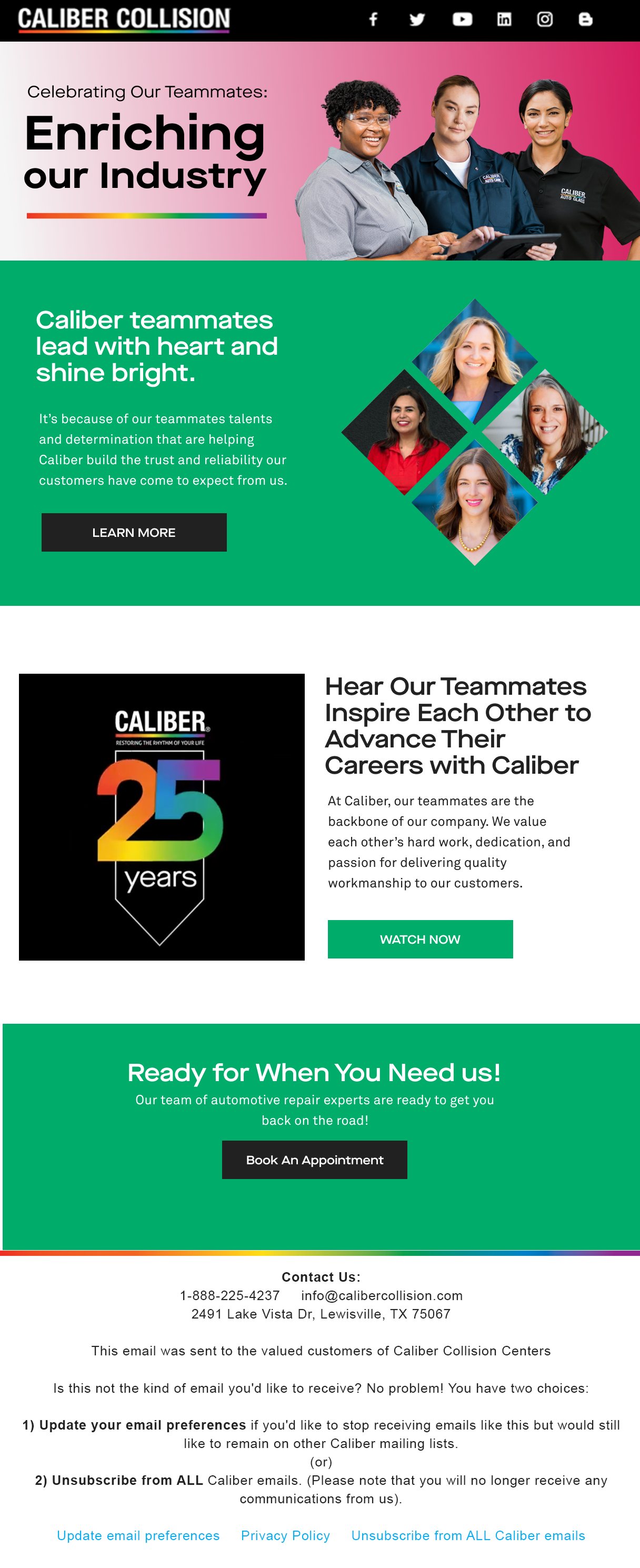
Every touchpoint — the landing page, the email, and each teammate feature — kept the same pink palette, quote treatment and photography style, so the campaign read as one connected story wherever people encountered it.

Training Brand Guidelines: TAP & Changing Lanes
Internal Guidelines Booklet
Partnered with the VP of Marketing to document how the Collision, Auto Glass and ProTech brands should be applied across Caliber's technician-training programs. I compiled an internal guidelines booklet so every training material stayed correctly branded, no matter which line of business it represented.
For people with little to no experience, working toward certification as a technician in Collision, Auto Glass or ProTech.
Built for military veterans and reservists transitioning into a technical career across the same three lines of business.