Selected Case Study — Healthcare Staffing

CareerStaff Unlimited

One site. Three audiences. Faster everywhere.

Research, information architecture and optimization that turned a cluttered, slow website into a single audience-based experience for clinicians, employers and corporate job seekers.

My Role

Senior Designer

Company

CareerStaff Unlimited

Project

Website Redesign, IA & Digital Optimization

Disciplines

User Research, Information Architecture, SEO, Web Performance

Collaborators

Marketing team & web agency vendor

Platforms

WordPress, Google Analytics, YouTube

80%Faster page load times
≤80KBPer optimized image
10→3Top-level menu items to audience paths
3Personas, one site
2Client accounts won via RFP landing page
01 / Starting point

A site trying to talk to everyone at once

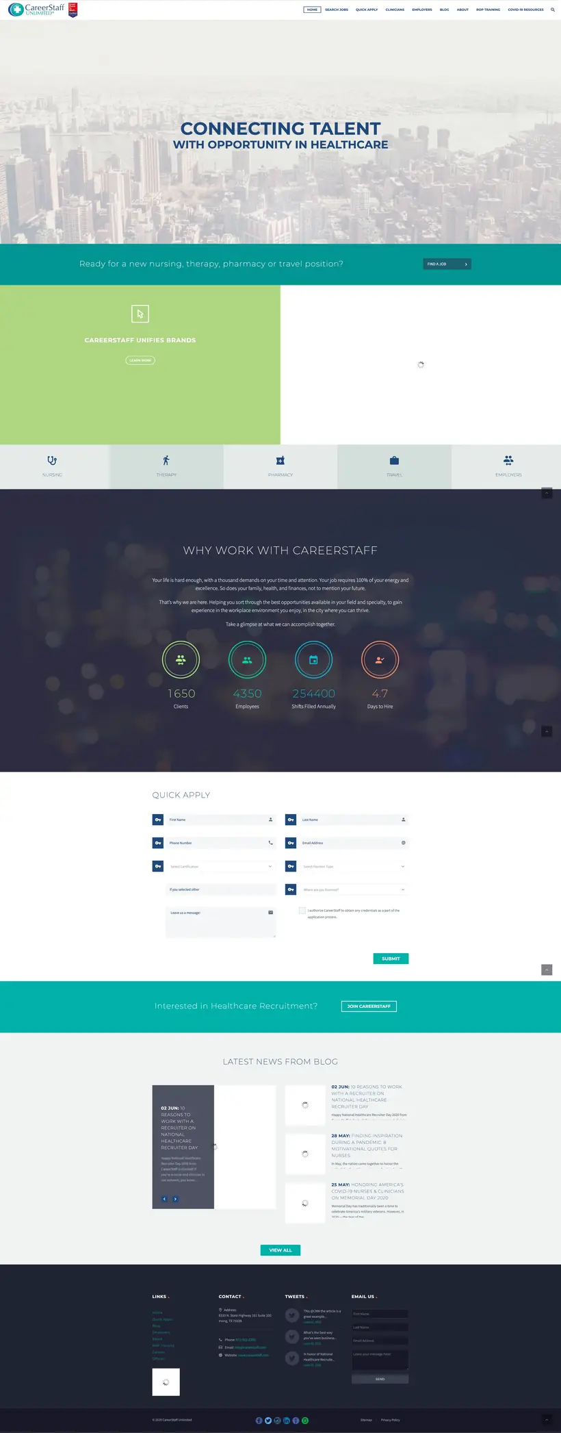
The original website mixed clinicians, employers, utilities and temporary content into one navigation, and heavy imagery slowed every page down.

careerstaff.com — before
Full-page screenshot of the original CareerStaff Unlimited website, with a city skyline hero, a crowded top menu and a Quick Apply form
Hover to scroll · Click to expand
What the audit found
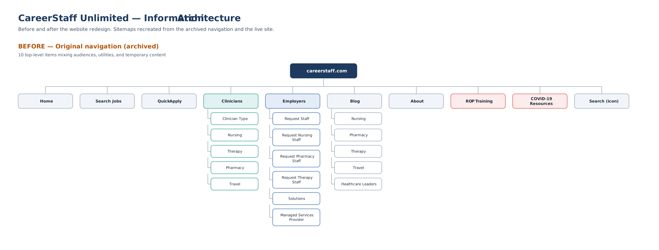
  • 10 top-level menu items mixing audiences, utilities and short-term content like ROP Training and COVID-19 Resources.
  • No clear path per audience. Clinicians, employers and corporate candidates all landed on the same page and the same messages.
  • One shared blog for every audience, so content was hard to target or measure.
  • Slow, image-heavy pages. Large, unoptimized images kept content loading long after the page opened.
My research contribution
SWOT analysis reportCurrent-site IA auditPersona research ×3Google Analytics review

The SWOT report and the before sitemap gave the team a shared picture of the problem. The persona research then shaped what each audience's section needed to say.

02 / Information architecture

From 10 menu items to 3 clear paths

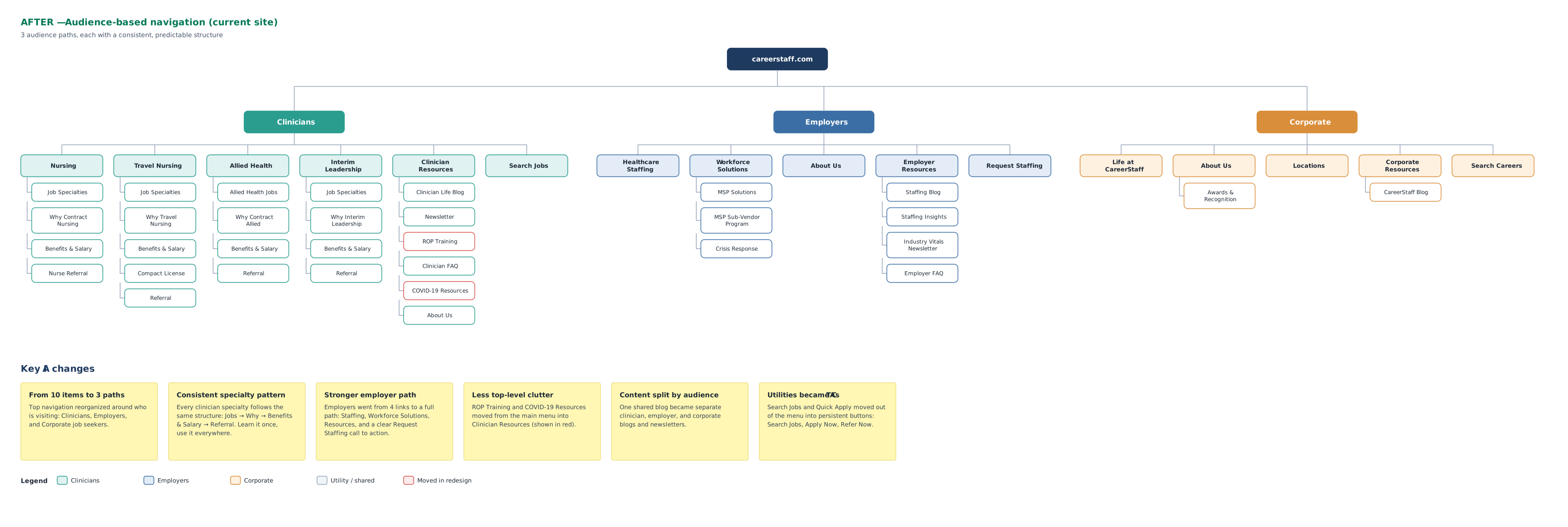
I mapped the old site structure, then designed the new audience-based structure: Clinicians, Employers and Corporate, each following a consistent, predictable pattern.

Before sitemap: careerstaff.com with ten top-level items: Home, Search Jobs, Quick Apply, Clinicians, Employers, Blog, About, ROP Training, COVID-19 Resources and Search
Clinicians Employers Corporate Utility / shared Moved in redesign
Organized by audience

The top menu is built around who's visiting: Clinicians, Employers and Corporate.

Same pattern for every specialty

Jobs → Why → Benefits & Salary → Referral. Learn it once, use it everywhere.

Stronger employer path

Employers went from 4 links to Staffing, Solutions, Resources and a clear Request Staffing CTA.

Less top-level clutter

ROP Training and COVID-19 Resources moved into Clinician Resources.

Content split by audience

One shared blog became separate clinician, employer and corporate blogs and newsletters.

Utilities became CTAs

Search Jobs and Quick Apply moved into persistent Search Jobs, Apply Now and Refer Now buttons.

03 / The new website

Three personas, one site

Instead of separate microsites, all traffic stays on one site, which makes page performance easy to compare in Google Analytics. Each audience gets its own color so visitors always know where they are, and the top bar switches between them in one click.

My role: The agency partner designed and built the site. I provided the persona research for each audience, helped set the creative direction and site foundation, and worked with the agency throughout the build.

Clinicians

Nurses & applicants

Pay, flexible schedules, jobs by specialty and a referral bonus, with Search Jobs and Apply Now always in reach.
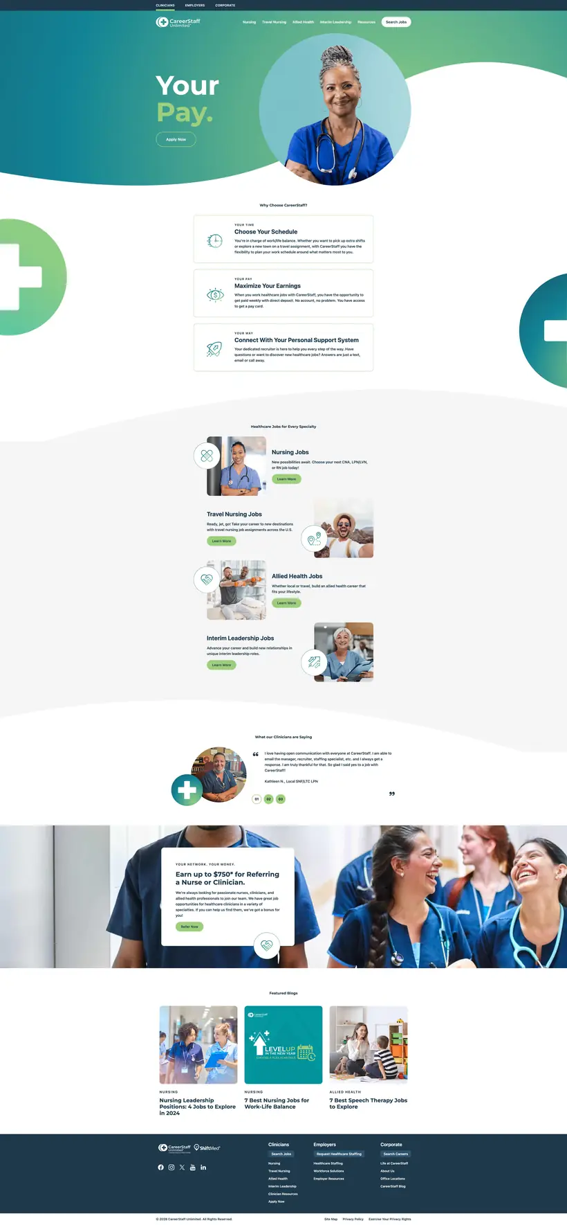
Clinicians
Clinicians homepage in teal and green: 'Your Pay.' hero, reasons to choose CareerStaff, jobs by specialty, clinician testimonials and a referral bonus banner

Employers

Healthcare facilities

Proof and solutions: a 1M+ clinician network, managed and vendor services, client testimonials and results in numbers.
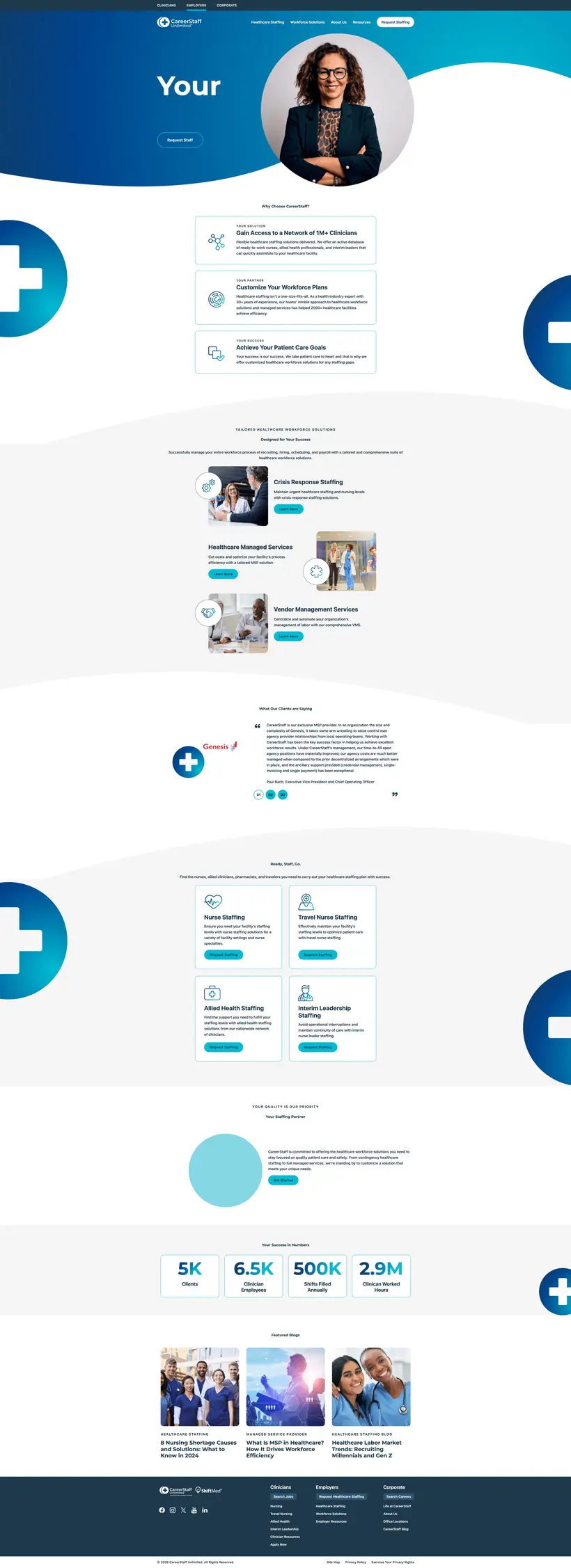
Employers
Employers homepage in blue: workforce solutions, crisis response and managed services, client testimonial, staffing types and success numbers

Corporate

Internal career seekers

Culture first: career paths by department, team stories, Great Place to Work® recognition and public reviews.
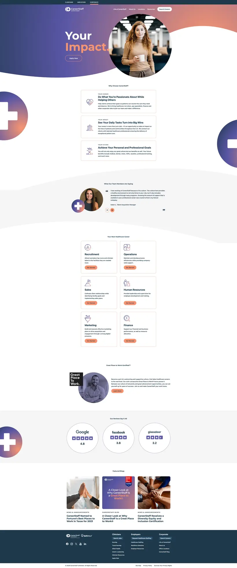
Corporate
Corporate careers homepage in purple and coral: 'Your Impact.' hero, reasons to join, team testimonials, career departments, Great Place to Work and review ratings

Hover a screen to scroll the full page · Click to expand

04 / Performance & visibility

Faster pages, easier to find

The structure fixed the "where do I go" problem. Optimization fixed the "why is this so slow" and "why can't I find it" problems.

80%
Page speed

Optimized the site one page at a time, compressing and reformatting every image to 80KB or smaller without losing the professional look. Load times dropped by 80%.

SEO
Search visibility

Submitted XML sitemaps and set up a WordPress SEO plugin so Google, Microsoft Bing and Yahoo could find and index every page.

▶
YouTube channel

With the team, optimized video keywords, hashtags and descriptions for search. I also redesigned thumbnails to earn more clicks and tuned the channel itself.

RFP
Conversion landing page

Designed an RFP-focused landing page around one clear conversion path. It helped secure two new client accounts.

← Back to selected work
Design principle

Make the experience better. Then make the improvement repeatable.

Discuss a project ↗